Main menu:
October 2026 Flickr Competition |
||||
Image Number |
Author/Flickr Name |
Image Title |
Position |
Judges Comments/Critique |
1 |
johnharvey96 |
SM |
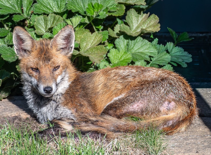
This is a nice portrait of one of our urban wildlife friends. Nice detail and very sharp. The lighting has made everything a bit contrasty and the animal appears to be squinting because of it but this is a well taken picture of a fox. |
|
2 |
johnharvey96 |
1st |
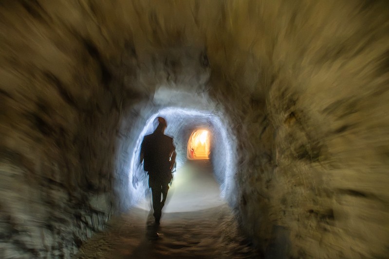
I like the creativity here and the lighting has done the photographer great favours. Wehear about heading for the light in a dark tunnel and that is exactly what we have. The composition with the offset figure is drawing us in to that golden light. The icing on the cake is the soft effect. Very good. |
|
3 |
jwhiting1952 |
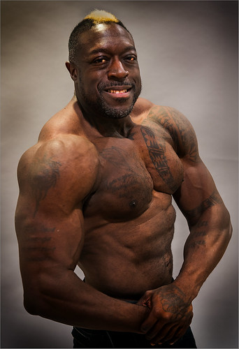
There is a tremendous amount of detail here and the pose is nicely arranged. The lighting and exposure has created some dark shadows and theface is not pin sharp but this is a ggod portrait of this bodybuilder. |
||
4 |
Best Snaps |
3rd |
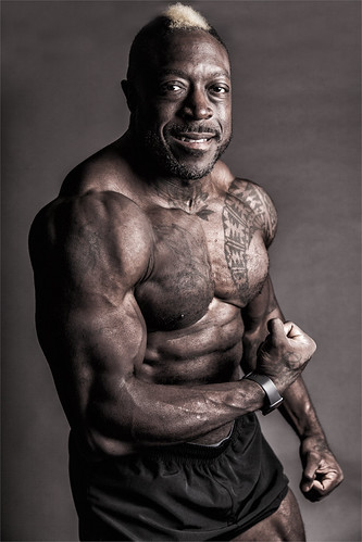
Similar to the previous bodybuilder image this one has great detail and the stronglighting has created a good sculptured image. This one is more successful as there is more detail in certain areas and the face is better rendered. There is nice quality here. |
|
5 |
jeff JT thomas |
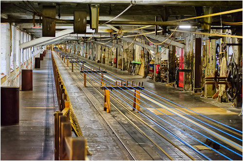
The ropery at Chatham Historic Dockyard is an amazing building and this image gives a good impression of how long it is. The diagonal view down ceertainly strengthens this feeling. The picture does feel strangely empty though and it can be worth waiting for the shuttle to be in position to add to the composition. As presented though this is a good record of the interiort of that building. |
||
6 |
jeff JT thomas |
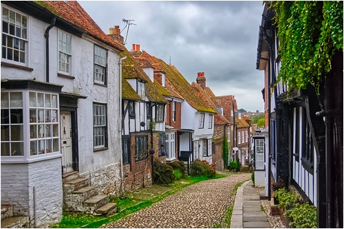
Well done on sewcuring an image which is devoid of a multitude of tourists! This is a classic view of this street and it has been nicely rendered. With the exception of some aerials there is also a timeless feel to it. I think there is a yellow colour cast which is easily removed or perhaps a monochrome/sepia effect could have been applied which could have worked really well here. |
||
7 |
garydrummist |
SM |
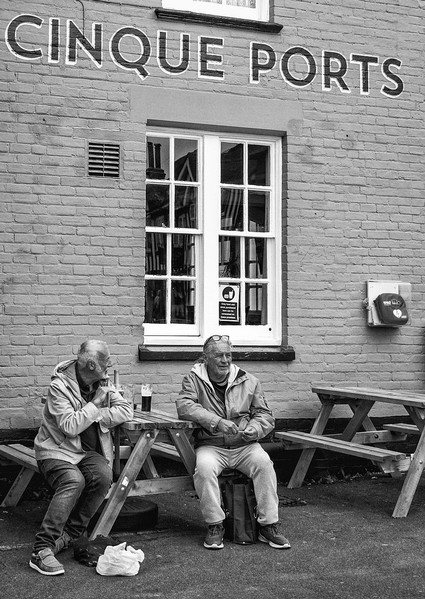
One can only imagine what these presumably old friends are talking about. The monochrome treatment has given this a reportage feel and including the pub sign tells us more of the story. The defribrillator tells us that this is a 21st century image for possible future viewers of it. A wealth of information in a well taken image. The monochrome treatment is also nicely done with a good range of tones and contrast. |
|
8 |
garydrummist |
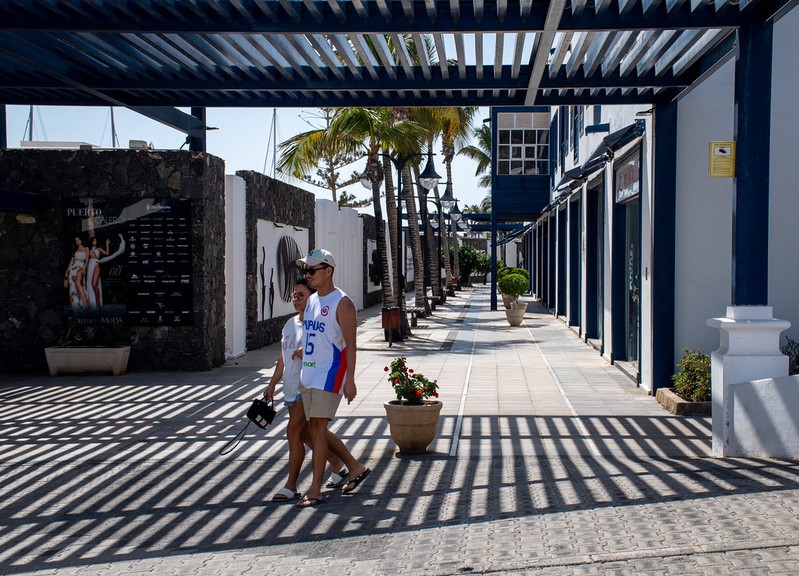
The image certainly fits the title. I like the sense of depth here with the receding lines. Considering the shadows the lighting on the couple is even and I like their position. Overall the image is very busy and a little distracting in places but it is something different and well seen. |
||
9 |
Roger Nolan LRPS |
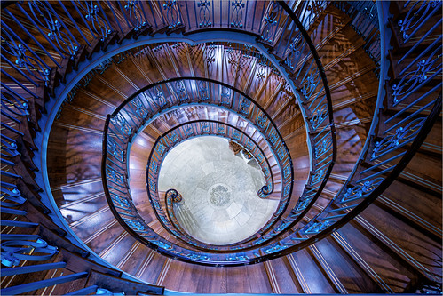
This reminds me of those impossible drawings by MC Escher. The swirl of lines all ultimately take us to the circular design on the floor. The lighting throughout is constant as is the colour palette which all works well. Could a figure featuring somewhere added a bit more? Who knows but as presented it is a very striking image. |
||
10 |
Roger Nolan LRPS |
2nd |
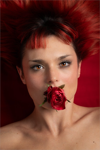
The colour red plays a tremendous part in this composition with all components of it having a red theme somewhere. The quality and sharpness, particularly in the eyes s fantastic and I like the connection between the model and the viewer.. |
|
11 |
anevillephotography |
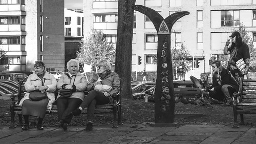
I like the idea here with the contrast between the generations but the finished image is a bit 'busy' and in effect there are two images here created by the vertical elements in the composition. Monochrome can be good for reportage images like this but here I think colour could have been the better option. The contrast and odd sharpness appears to lose the important details instead of accentuating them. As I said I really like the idea here and it is certainly something worth pursuing. |
||
12 |
anevillephotography |
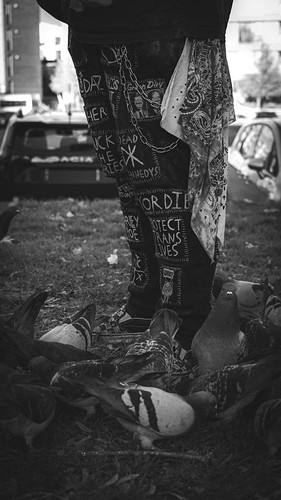
It took me a little while to understand the title here until I spotted the bird. Again the story here is very good but is let down by the presentation. I would certainly crop out the very bright areas which are competing for our attention with the important elements here which are rendered very dark. A square composition concentrating on these with some adjustment to the contrast and brightness would improve this no end. As I said on the previous image I really like the story here and it is something to pursue. |
||