Main menu:
May 2025 Flickr Critique |
||||
Image Number |
Author/Flickr Name |
Image Title |
Position |
Judges Comments/Critique |
1 |
Best Snaps |
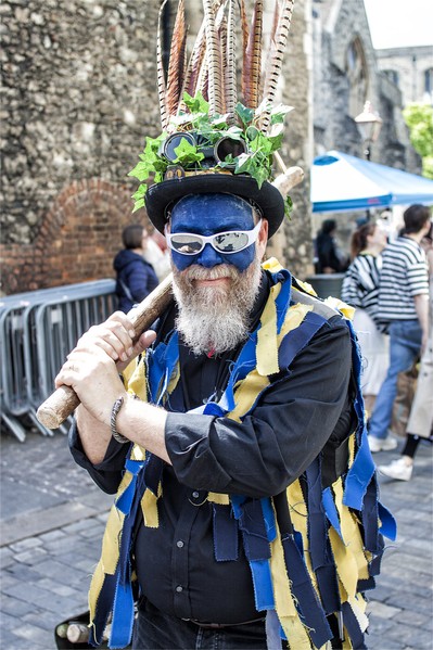
There is real character captured in this image. The traditional Morris type clothing is great but the modern sunglasses give a great twist to it. Detail and sharpness are goosd. However, the background is very distracting and bright and the metal railings are not great additions. The background reveals that this is somewhere like Rochester and I think it could have been worth asking if the subject could pose in front of one of the ancient buildings there. The figure is very good so it could be worth cutting him out and using it elsewhere? |
||
2 |
paulrayment4500 |
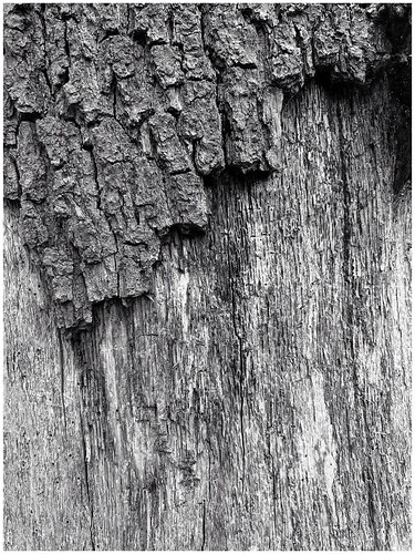
Texture and monochrome are often a good combination and this is a nice example of how they can work together. I think I might have cropped the left side so that the top texture is an upward diagonal from the left. Contrast is a tad high but sharpness is very good. |
||
3 |
johnharvey96 |
1st |
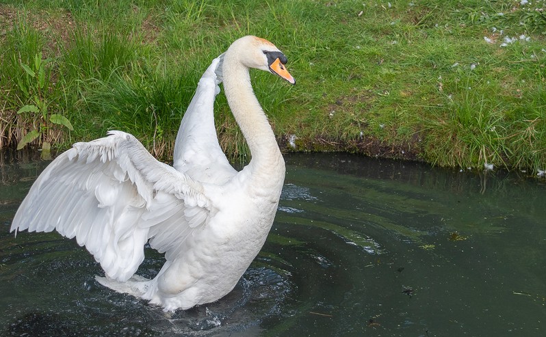
There is much to enjoy here. The bird has struck a great and different pose from many swan images we may have seen. The lighting is nice and soft and this has ensured that all the detail is retained in the highlight areas of the feathers. Focus is spot on as well. Very good. |
|
4 |
johnharvey96 |
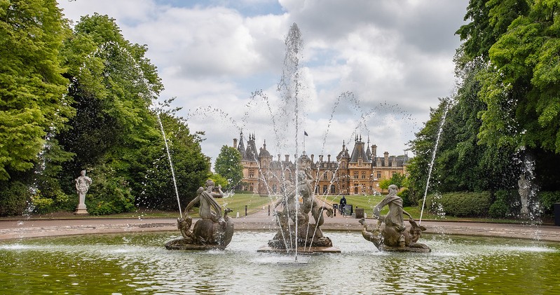
This is quite a nicely composed image and the fountain creates a nice frame. The house itself is quite obscurred by the foreground but I think a side step to the left could have brought it more into view and the right hand statue may have been better framed in the water spray similar to the left hand statue. Nevertheless the image shows that the photographer took care with this composition. |
||
5 |
garydrummist |
2nd |
I very much enjoy the story here. The expression on the subjects face reveals a great deal about his relationship with the phone that day. The image itself does exhibit a fair amount of grain and is not particularly sharp but this is outweighed to a certain extent by the story it tells. |
|
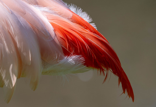
6 |
garydrummist |
SM |
There is a brilliant quality in the feathers here which have great detail and tones. The muted background works very well apart from the slightly distracting light circle area. Nevertheless, a nice study of these feathers and well done for ensuring the contrasting red feathers are nicely placed in the composition. |
|
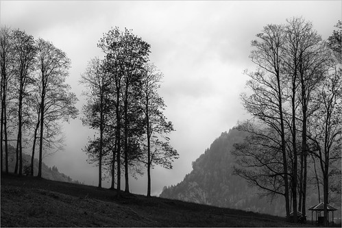
7 |
Roger Nolan LRPS |
Although the lighting in this monochrome image is very flat there is still a great control of tones throughout the tonal range. The composition is nicely arranged with foreground and background elements. The dark front left area does occupy a large area although as previously mentioned the photographer has successfully retained detail here. |
||
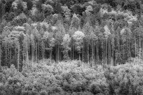
8 |
Roger Nolan LRPS |
3rd |
The crowning glory of this image is the range of tones that appear to have been very carefully controlled. The light tones could indicate the use of infra- |
|
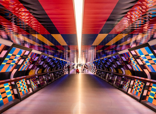
9 |
AlanBenn |
Ther diagonal lines are varied colours give a great deal of depth to this image which I think could have been enhanced more by having the figures in the background positioned further forward in the composition. This could have created a layering effect. I imagine controlling the exposure was not easy and there is some flare in the image but well done for capturing this. |
||
10 |
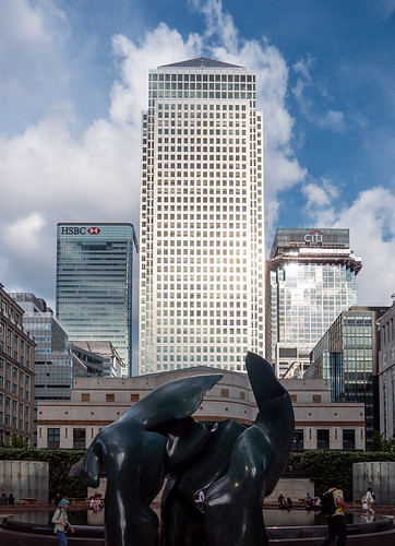
AlanBenn |
The three buildings with the great cloudscape behind certainly fit the title well and are very well lit with just a little highlight burn out. I'm not sure about the dark object in the foreground and the cropped figures. I like the idea of the composition and think, if possible, the same idea but taken further away with a telescopic lens which would compress the perspective even more could be worth trying. |
||
11 |
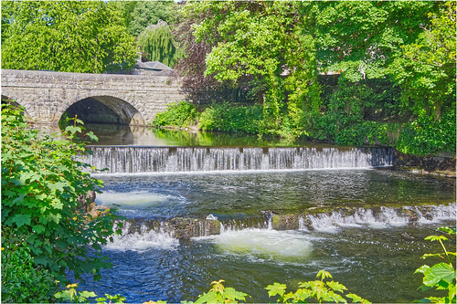
jeff JT thomas |
This is a very pleasant landscape image captured in good conditions. The diagonal composition takes us in through the image nicely. I think I would crop out the foreground foliage and the half arch of the bridge to strengthen the composition. Although this was a bright day there are no dark blocked up shadows or burnt out highlights. |
||
12 |
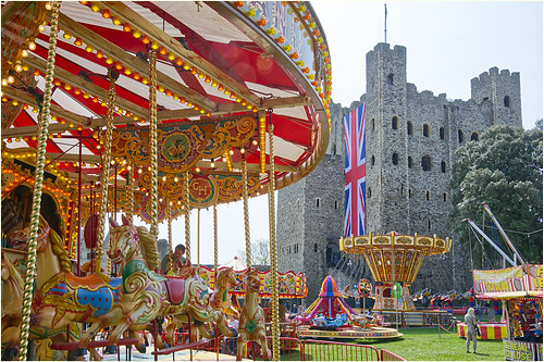
jeff JT thomas |
SM |
I like the composition here which is nicely arranged and shows just enough of the various elements to tell the story. There is sharp focus from front to back and the exposure is nicely balanced. I think the bottom crop is a bit tight but it could be the railings that dictated that. Nice. |
|