Main menu:
| June Flickr Competition |
||||
| Theme - |
||||
| Judge - |
||||
Image Number |
Flickr Name/Author |
Title |
Position |
Judges Comments/Critique |
1 |
johnharvey96 |
There is much to admire here. The lighting conditions although bright have lit the subject well and provided some modelling to the sculture. The composition is fine and the details such as the cable car show where the location is. It is a shame that the base of the artwork has been cropped but otherwise this is a fine image. |
||
2 |
johnharvey96 |
Many of the comments from the previous image also apply here with the addition that the subject is a little small in the frame. I wonder if a different title would help or change the viewpoint and/or lens to enlarge the cable car in the image space. |
||
3 |
Best Snaps |
This is a fine effort. The exposure and focussing have provided a wealth of detail in the thistle head itself and I love the background which is nicely diffused but revealing enough detail to prove this was taken on location. There are a couple of details I would look at which are the white patch behind the grasses which I would subdue if possible and I would also clone out the plant stem intruding into the base of the image. |
||
4 |
Louise Hubbard |
The use of monochrome works well here and is in keeping with the subject although the atire of the passengers reveals this as a modern image. The monochrome treatment is a little contrasty and grainy and reminded me of the results you would obtain from printing colour negatives on black and white paper back in darkroom days. Composition and sharpness are very good. |
||
5 |
Louise Hubbard |
2nd |
Colour popping is often maligned but like any technique it can work well in the right situation and here I quite enjoy it. Great care appears to have been taken to repeat the colourisation on each bike and I like the composition that fills the frame. My only minor niggle is I would have preferred more space at the front of each bicycle and not at the rear but this is a minor thought on my part. |
|
6 |
steveakehurst |
SM |
An interesting image. I like how the long exposure has created movment in the clouds which has not obscured the stars beyond. The vegetation is not pin sharp but it is a good addition in the foreground. Something interesting and different. |
|
7 |
steveakehurst |
This is a fine subject which is not as easy to take as you may think. I like the attitude of the aircraft here which exudes dynamism and the chosen shutter speed is great. I don't like seeing frozen prpopellor blades but this is spot on. My main concern is that the aircraft is small in the frame. Unfortunately it is not sharp enough to do a selective enlargement. |
||
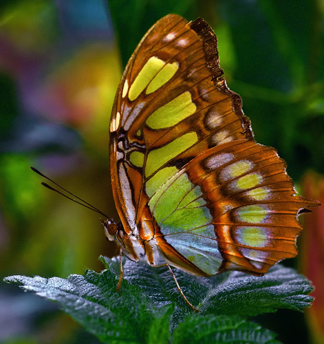
8 |
kevin towler |
1st |
A bright, colourful and highly detailed study of this insect. The background reveals this was taken on location. A minor niggle is the highlight which I would address. Nevertheless a great image. |
|
9 |
Keith Tomlins |
A true minimalist picture. The placement of the anglers is great. If this was mine I may have tried to exclude the sky and just have the anglers surrounded by the water. This would have removed the brightest part of the image and concentrated my gaze on the two figures. |
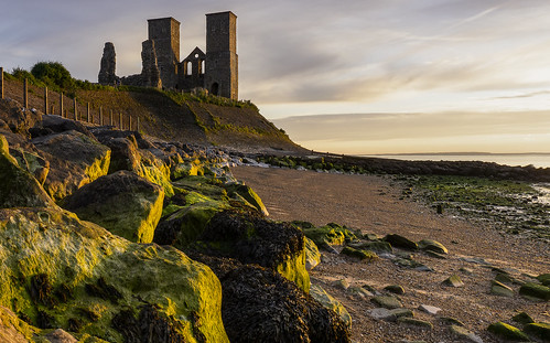
||
10 |
Keith Tomlins |
Reculver is a classic location for landscape photography and this image is a good reason why. The condtions are great and the photographer has chosen a good time to take advantage of them. The lighting has picked out some good edge detailing. The right third of the image is a bit of a dead spce for me and I would be tempted to crop it off which would also reduce the large bright area formed by the strip of cloud. Nevertheless this is still a good landscape. |
||
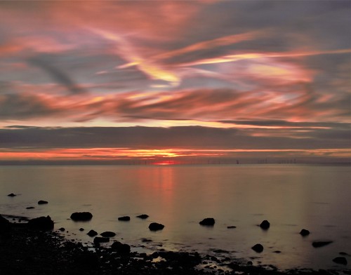
11 |
marytomlins |
This is a great sunset and I like the appearance of movement in it. The rocks in the foreground are a good idea but there is an empty middle area and I wonder if lowering the camera more towards ground level would have accentuated the rocks more and reduced the dead space. Either way it is a great sunset and I understand the connection with Turner with the way the light glows. |
||
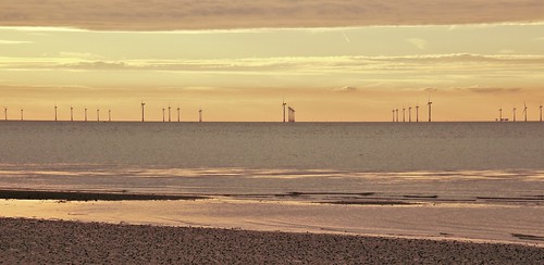
12 |
marytomlins |
Offshore windfarms are becoming a common sight around our coastline and are attractive subjects. However, obtaining an original image is not easy but I like the inclusion of the golden light here and the different lines of beach, sea, turbines and sky. Another approach here is to crop it severely to a thin letterbox of just the turbines themselves. Within the image I can see another possible image to the right with the turbines and the Maunsell Forts. This would require a very long lens but could be worth a look. |
||
13 |
kevin towler |
SM |
The detail and quality of the insect itself is very good and I like the composition as a whole. The insect is a little tight on the right side but it has not hit the frame edge. The colour is interesting as it appears to be enhanced and slightly unreal similar to an underexposed slide in film days. An interesting approach but still enjoyable image. |
|
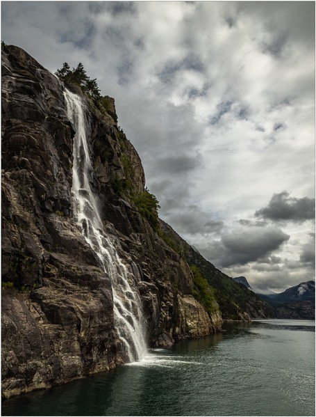
14 |
Henry Slack |
SM |
A very nice landscape image with good contrast range and detail throughout. The waterfall detail is nicely captured and the photographer has resisted the urge for the big stopper filter long exposure route and chosen to render the water more naturally which I quite like. The conditions do not require sunglasses but instead the soft lighting has created a wealth of detail. |
|
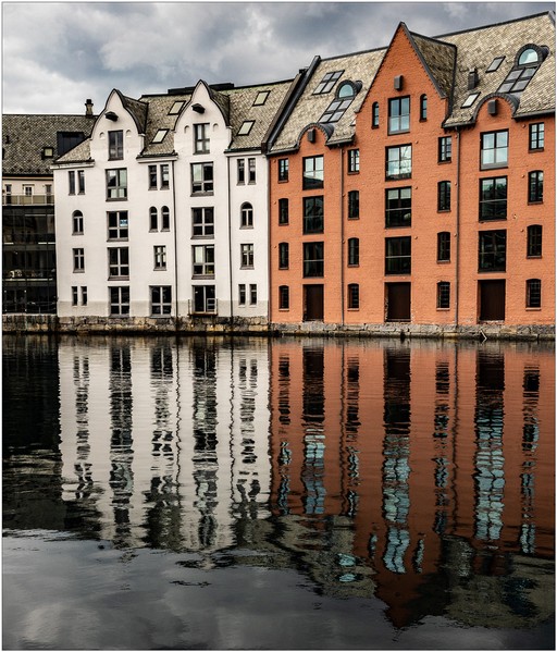
15 |
Henry Slack |
This image has been presented as a perfect split between the seen and reflected image with just enough movement in the water to retain the detail of the buildings and sky in slightly ruffled form. It may be a cliché but I think something in the water on a third would have just created a zing point to rest the eye on. Again soft lighting has retained the detail throughout the tonal range. Nicely produced. |
||
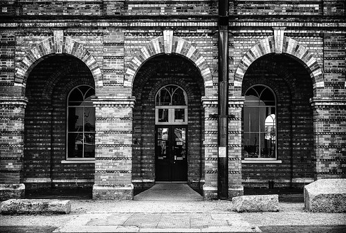
16 |
Stephen Long2011 |
In many respects this is a pattern picture and careful examination of the building reveals it to be highly symmetrical. If I had taken this I would have tried to emphasise how symmetrical it is by making everything even, unfortunately, I think the photographer was one step to far to the right to balance it perfectly. Having said that the monochrome conversion although slightly contrasty is full of detail and the arches work well within the composition. |
||
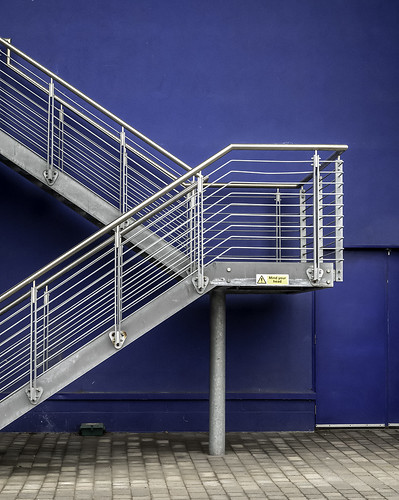
17 |
Stephen Long2011 |
3rd |
This is a well seen and modern image. It is very minimalist with just three basic colours and stark simple composition. The colour contrast between the metal and the blue is excellent. There are small details I would have been tempted to address such as removing the green box, (vermin trap?), the warning sign and cropping the right slightly to remove the edge of the door. Then I think this will be a top image for any competition. |
|