Main menu:
June 2025 Flickr Competition |
||||
jeff JT thomasImage Number |
Author/Flickr Name |
Image Title |
Position |
Judges Comments/Critique |
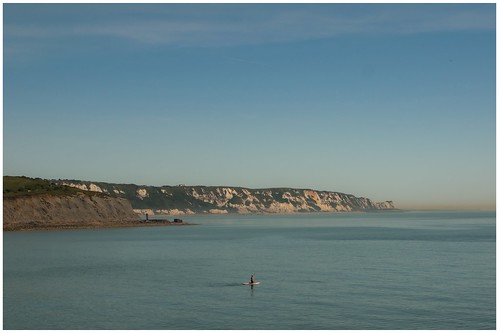
1 |
anevillephotography |
This image certainly fits the title. There really is a sense of tranquility here. At first glance I thought there was too much dead space but I think cropping and/or zooming in may reduce the atmostphere. This is an image that could look good on the wall. |
||
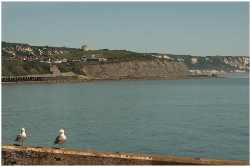
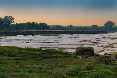
2 |
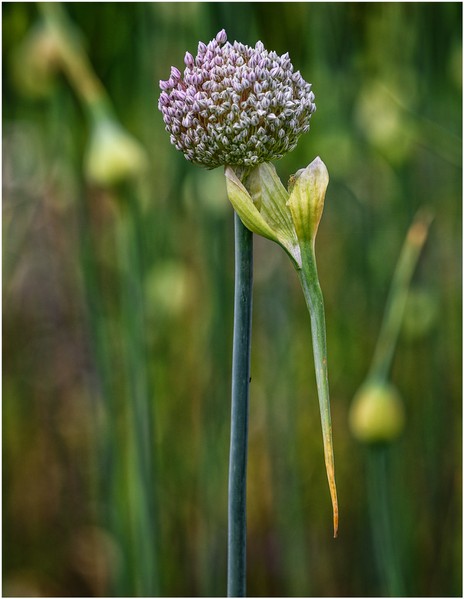
anevillephotography |
I actually live in Folkestone so this is a view I know well, the East Cliff in the background is a very historic area. I like the story here with the seagulls. I think I may have experimented with different compositions and lens combination to perhaps have the birds larger and more central in the frame. I ike the warm tones and you were blessed with some great weather which you have used to your advantage. |
||
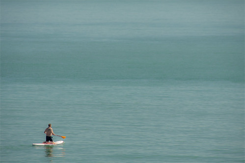
3 |
Best Snaps |
This image has a great deal of dead space but it has a story detailing why there is this space. The paddleboarder neatly points us into the imager. I think I might have placed him slightly higher in the image space but otherwise I like this. |
||
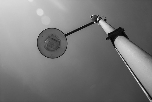
4 |
Best Snaps |
A simple but effective image. I like how the lead in lines and shapes fill every part of the composition. As presented it is good although I would have cropped out the half flare spot at the top. Out of interest it could be an interesting exercise to flip this horizontally and have the leading lines coming in from the left and also turning on the light. Just a thought. |
||
5 |
jwhiting1952 |
This looks to be an interesting location but this image does not do it justice for me unfortunately. The foreground grasses intrude and overall the image appears dark and lacking in contrast. However, there is a good recession and sense of 3D and the colours in the sky are attractive. |
||
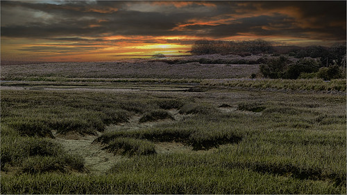
6 |
jwhiting1952 |
There is no doubt that this image is full of atmostphere, the sky in particular is very striking. The image appears very noisy with harsh contrast in the grass area and I wonder if this was underexposed and adjusted in post processing. Once again the location does look to be full of possibilities. |
||
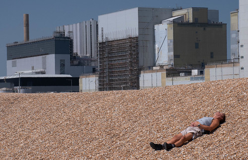
7 |
garydrummist |
SM |
Some great originality here and I like the story. I grew up on Romney Marsh and the Dungeness power station was ever present on the horizon. There is much to enjoy here and the quality of exposure etc is very good. |
|
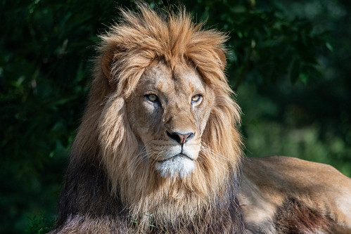
8 |
garydrummist |
1st |
What is clearly evident here is the shere quality of the image. The lighting, focussing and the amount of detail in the fur is execptional and the eyes, the most important part of any portrait are sharp and full of life. This image could work equally well cropped down to portrait format. Excellent. |
|
9 |
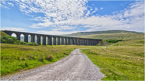
jeff JT thomas |
A very nice landscape image with an excellent lead in via the road to the subject and then a great sky to finish it off. However, there is one small detail which distracts slightly which could have been used to improve this image further and that is the cyclist travelling away in the distance. If this was taken a few seconds earlier when he was further forward in the image it would have served as a stronger lead in. still nice though. |
||
10 |
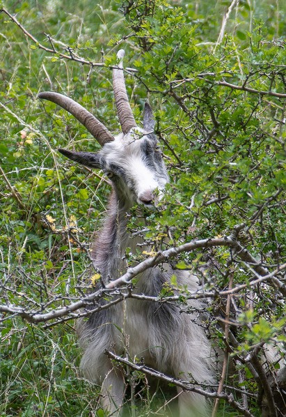
johnharvey96 |
What makes this image is the tilt to the head which gives the animal some character. There is some nice detail here although the nose is completely burnt out. To strengthen the composition I may have cropped in closer to the head and chest area and lost the legs. Good to see the photographer ensured the eyes were not obscurred by the foliage. |
||
11 |
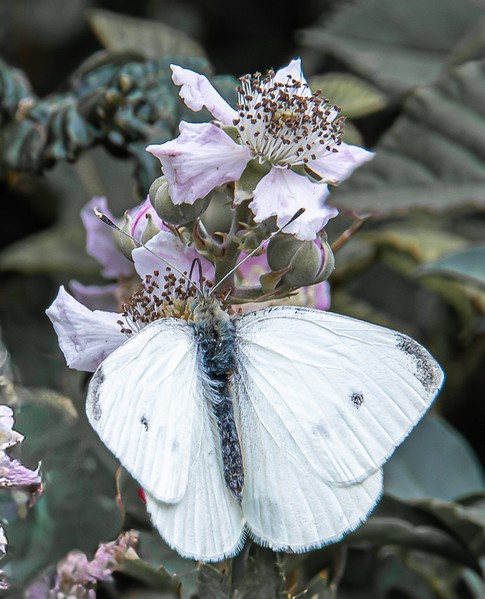
johnharvey96 |
2nd |
The photographer is to be congratulated here for retaining the delicate detail in those white wings and for capturing this specimen 'in the landscape'. The background is nicely lowered in exposure therefore concentrating our gaze on the foreground. |
|
12 |
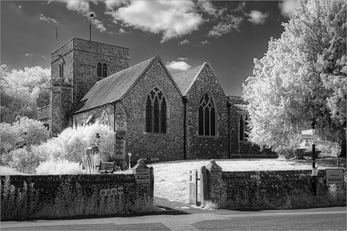
Roger Nolan LRPS |
3rd |
This is a very nice example of the use of infra- |
|
13 |
Henry Slack |
SM |
There is a wonderful quality to this and masterful control of depth of field. It would have been easy to crop this into a tall portrait format letterbox shape but instead we have a wider view taking in the surrounding foliage. An aperture has been selected to ensure that the subject is sharp but also shows enough detail in the background but in a soft painterly style. The highlights are nicely controlled and nothing has been awkwardly cropped. Very nice. |
|
14 |
Henry Slack |
This is an interesting subject and the photographer has arranged the composition well. The wave shape is very good and well seen but the careful placement of the seaweed and that stop in the dip of the left wave shape are very important elements. |
||
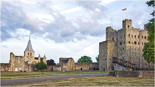
15 |
jeff JT thomas |
This area of Rochester is obviously very historic and this image captures the scene of these famous Norman buildings very well. Technically very good with negligible convergence and great detail. The lighting has certainly worked to the photographers advantage. The white streak across the sky is a distraction I would have cropped out but whether through luck or judgement the family group is an excellent addition to the composition. |
||