Main menu:
July 2026 Flickr Competition |
||||
Image Number |
Author/Flickr Name |
Image Title |
Position |
Judges Comments/Critique |
1 |
anevillephotography |
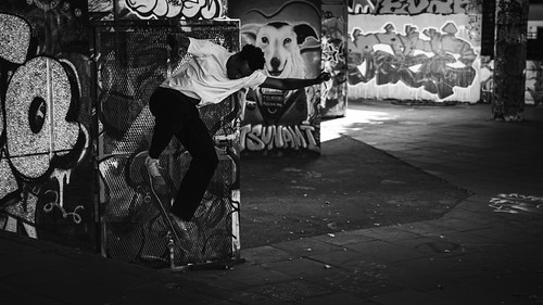
There is a good moment in time caught here and the use of monochrome has given it a newsworthy and timeless feel. Unfortunately, the shadow areas are quite dark and devoid of detail in the darker areas and that is where a great deal of the action is. Conversely, the brighter areas which always draw the eye have more detail to explore but is away from the action. Personally I would have lightened the darker areas and cropped close to the dog portrait. Incidentally, the dog is brilliant and well spotted! |
||
2 |
anevillephotography |
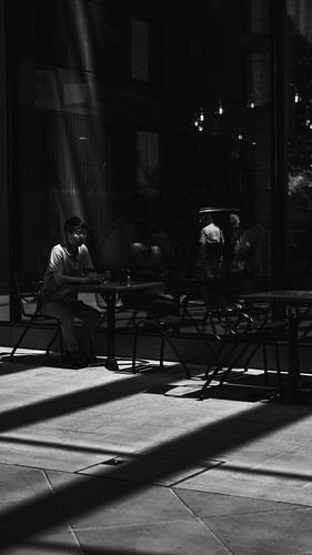
Many of the comments which I gave to the first image are also relevant here. The light and dark areas are nicely separated and important details are revealed in the lighter parts but overal the image is very dark. I'm sure some careful adjustment with contrast and light values could tease out some great details and improve the look. The monochrome route is the way to go again with this which is good. |
||
3 |
Best Snaps |
2nd |
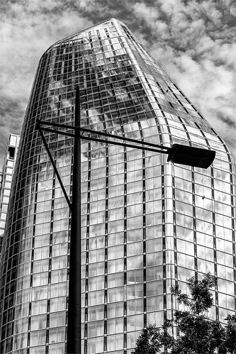
This image works very well indeed. I remember back in the 1990s how London Docklands was the place to go and I came away with monochhrome images similar in style to this. The subject certainly serves monochrome photography well and here the tones and contrast have been well handled. The shape of the building looks to be quite unique and is a great find. The lampost adds that special extra and the way it is angled around is very good. Nice. |
|
4 |
Best Snaps |
SM |
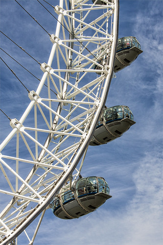
This is an interesting take on the London Eye. The photographer was blessed with some excellent light and taking just the three pods works very well. With that excellent sky detail I think this would also work well as a monochrome image too. |
|
5 |
johnharvey96 |
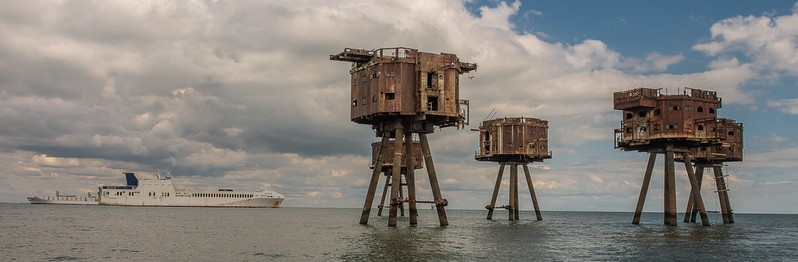
These sea forts are certainly interesting structures with the feel of 1960s sci- |
||
6 |
johnharvey96 |
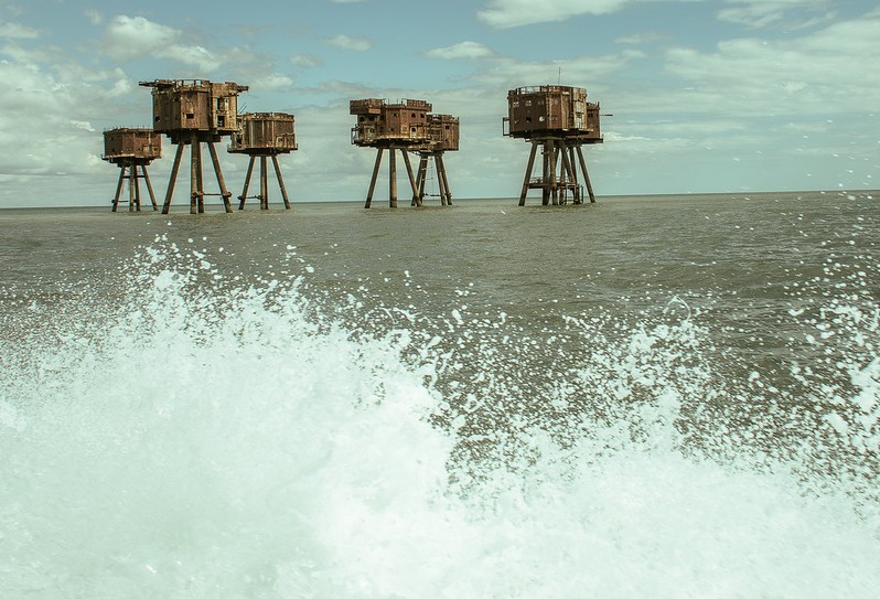
Another original take on the Maunsel sea forts. The sea looks very smooth so I'm assuming this is the spray and wake from the boat which fills the foreground nicely. The horizon is off of course and there appears to be green colour cast but well done once again for creating a different view of this well photographed location. |
||
7 |
Henry Slack |
3rd |
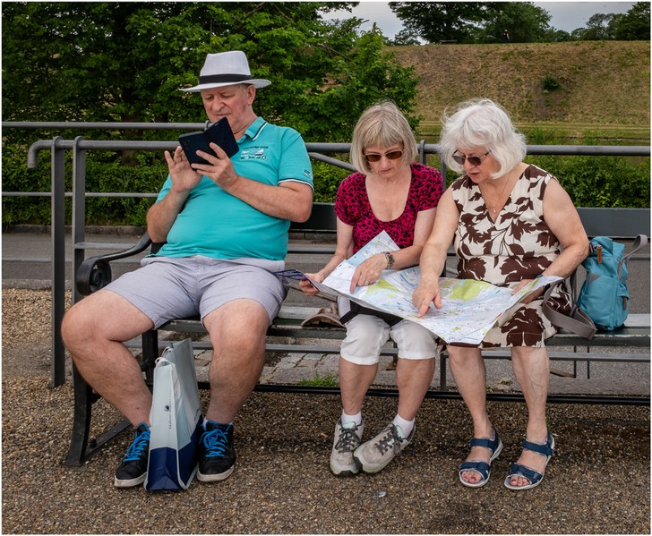
I like the story here. The ladies are carefully studying the map and I can guess that the man is looking at a mapping app and looking very smug with it! I could be wrong but I like that idea. Everything in the image supports the story with no extraneous detail. Simple but well seen/done. |
|
8 |
Henry Slack |
SM |
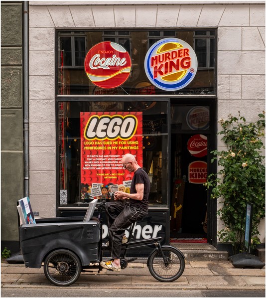
When I first viewed this image it looked jumbled and cluttered and I didn't understand the advertising signs. However, a second viewing and reading the attached text filled in the details I required to understand the image. It is another one that tells a good story but needs careful viewing to fully realise what is happening. It is certainly a good portrait of 'Artpusher'. |
|
9 |
jeff JT thomas |
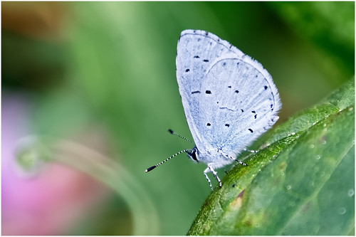
Thereis a great deal to admire here. The composition is very good and the colour palette works very well. It is a little unfortunate that the butterfly itself is not sharp, I'm not sure if it is a focus issue or movement . Otherwise this is a fine image. |
||
10 |
jeff JT thomas |
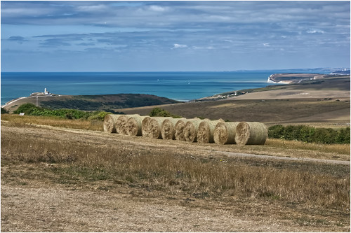
The landscape at Beachy Head is great for photography and this is a nice view looking west. The straw bales are nicely placed in the composition and lead us into the image. I am not sure if it is deliberate or not but the soft background and lack of fine detail a slight shame. I think this would look nice as a canvas on the wall though. |
||
11 |
garydrummist |
1st |
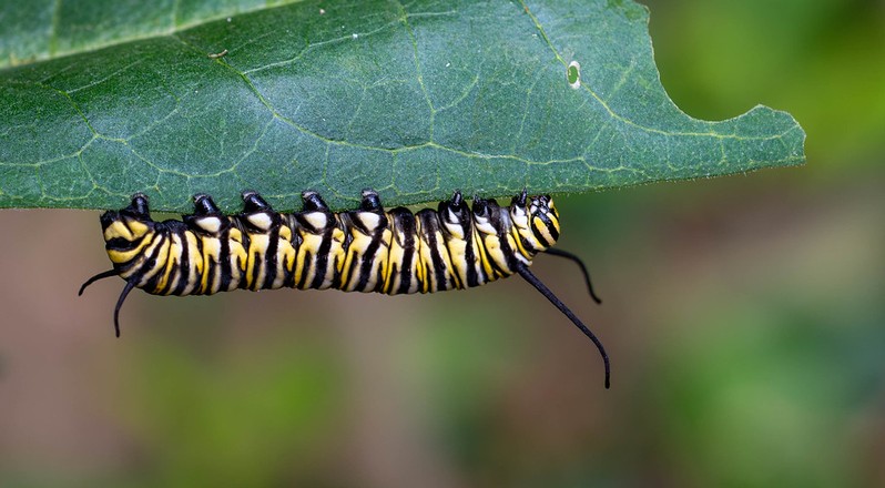
I think this has been very nicely done. The caterpillar is very nicely placed and the colour palette again is great here. A very important part of this image is the chewed leaf on the right hand side which tells the story why the caterpillar is here. The focussing and sharpness is spot on where it needs to be. Nice. |
|
12 |
garydrummist |
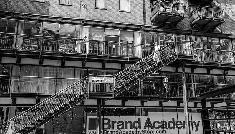
I can see the idea here by using the steps to tie the various aspects together which is very good but I think I might have finetuned the final execution. The photographer may like to create images straight from the camera which is good but personally I may have been tempted to do some post processing to perhaps remove the top of the image and play about with the convergence to emphasise those steps more. The use of monochrome is good but it is a tad contrasty here for my tastes. Nevertheless, there is certainly great scope for many images here. |
||