Main menu:
January 2025 Flickr Competition |
||||
Image Number |
Author/Flickr Name |
Image Title |
Position |
Judges Comments/Critique |
1 |
Best Snaps |
There is a much to enjoy here from the pose, to the expression and the lighting. The use of monochrome is a good idea but it is a little too high contrast with detail lost in the shadows in particular. Otherwise a fine image. |
||
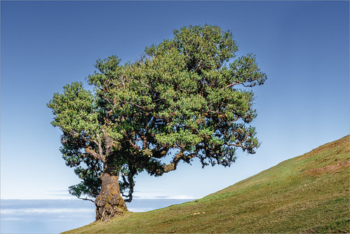
2 |
Roger Nolan LRPS |
SM |
This is an interesting subject and shape the branches have formed which mimics the angle of the ground is very interesting. I imagine it could be confusing getting the horizon correct but I can see from the clouds that it is correct here. Great lighting and great detail complete this image. |
|
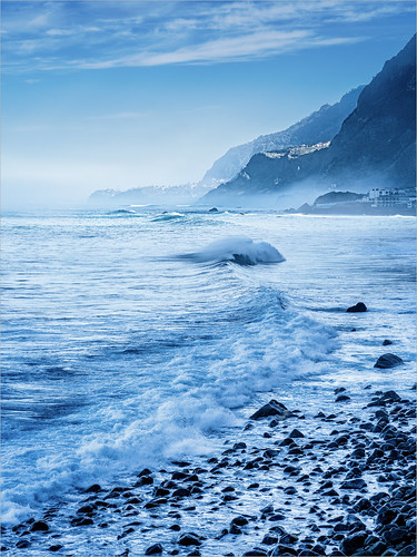
3 |
Roger Nolan LRPS |
2nd |
I enjoy the lead in here from the front left which gives this great depth. The timing is good with excellent detail in the waves and spray. The blue tone in intriguing but it all adds to the atmosphere of this shot. |
|
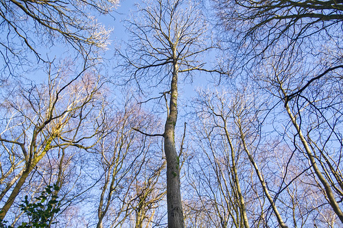
4 |
jeff JT thomas |
These images are often seen and a secret is to have something to act as a zing point usually something which is different from the other subjects. For me in this instance it is the tree in the middle. It is good how it is surrounded by the other trees but still has its own space. Nice lighting and loads of detail. |
||
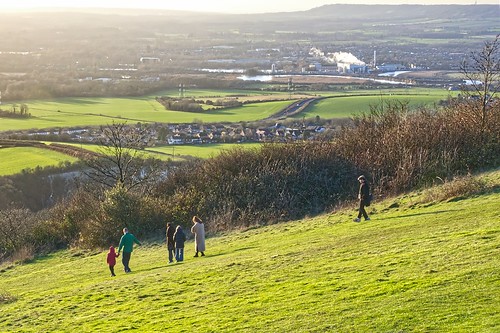
5 |
jeff JT thomas |
I enjoy images with a story and this one certainly has that. It could be argued that the group are walking out of the image but that is balanced by the lone figure walking behind. I think there is an issue with the colour balance and I would certainly have cropped out the sky area. This still leaves a nice area of landscape in the background. |
||
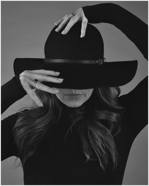
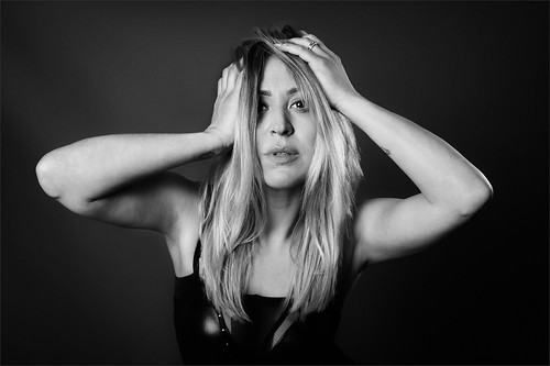
6 |
anevillephotography |
There is a classic 60s feel to this. I certainly enjoy the strong pose and the shapes created. The use of monochrome is the perfect choice but I think the image needs some fine tuning. The exposure on the hands is good but I think the face needs to be lifted in tone to match which I think would work well. The subjects right hand is also a little soft but other than that this is a good image. |
||
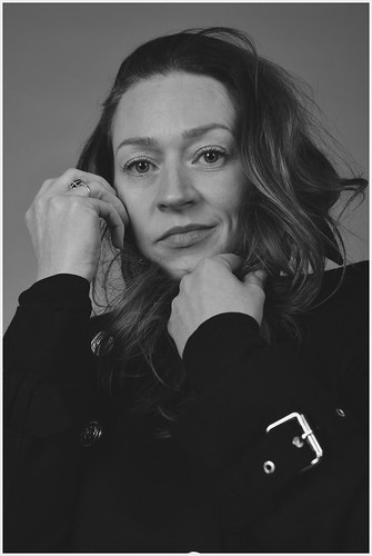
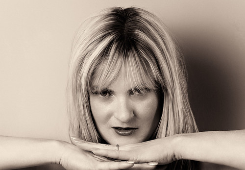
7 |
anevillephotography |
This is a good portrait with real character in the face. The eyes in particular really grab the viewers attention. The buckle is very bright which I would remove or tone down. The monochrome contrast is a tad low which has muddied the blacks and flattened the skin tones so I would raise that. A very nice portrait. |
||
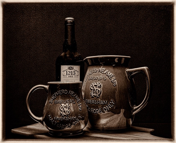
8 |
Henry Slack |
3rd |
It is obvious that there has been a great deal of thought gone into this. The arrangement appears to been carefully planned, as has the lighting. The subjects match the title and just for good measure a sepia tone has been applied. The frame is a nice touch as well. The image is a little contrasty and I may have sftened it to add to the aged feel but overal I like this very much. |
|
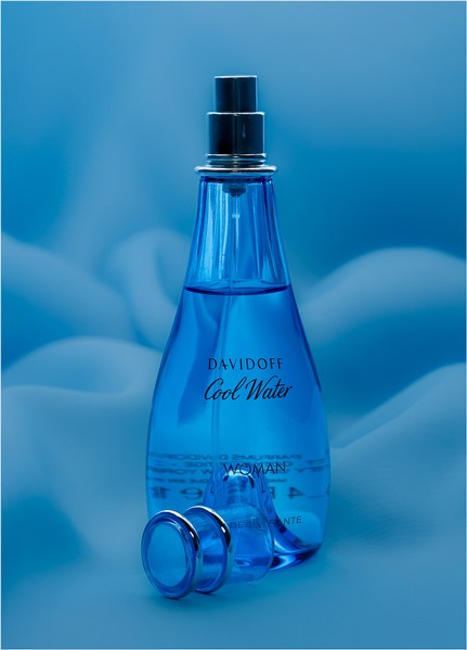
9 |
Henry Slack |
SM |
This could easily have been an advertising shot such is the quality. The lighting, cool colours and the dark reflections on each side of the bottle reveal a skill for photographing glass. The text could be distracting but it is relevant to the subject. Very good. |
|
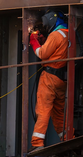
10 |
johnharvey96 |
Taking an image such as this obviously means taking heed of safety precautions which is why the photographer is away from the subject. (I note the welder has also taken safety precautions which is good to see). This is more of record type shot of this welder which is good but perhaps a more effective pictorial image would have been to zoom closer into the top half of the image and where the action is around the welding torch. Still well seen and well taken. |
||
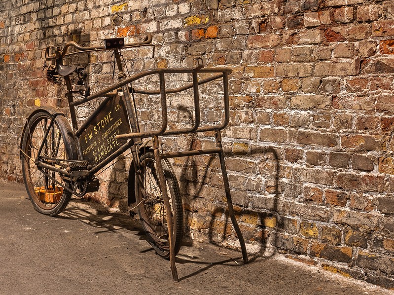
11 |
johnharvey96 |
I wonder what stories this bike could tell? The patina and rust which is well captured here reveals it's age and the orange/brown colours all add to the old feel. I think this could have been a good candidate as a sepia toned monochrome image. I might have cropped off the right of the image to create a square format image. Text can be a distraction in an image if it is not linked to th subject but here it perfectly reflects some more of the subjects story. |
||
12 |
Dave Belsham |
1st |
This is a very different type of portrait which appears to tell a story. The pose and the expression certainly conveys a sense of fear. The monochrome treatment is nicely controlled with great contrast. What particularly caught my attenion was the dark eye with the single point of light which really seemed to accentuate the title again. |
|
13 |
Dave Belsham |
SM |
There is a nice quality hear with superb detail especially in the hair. I like how the hands and arms form a nice supporting base to the composition. The use of sepia is an interesting idea. I like the lighting but I wonder if the dark shadow could be lifted to balance the background more? Nevertheless, an engaging portrait. |
|
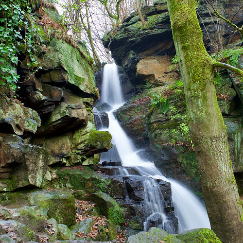
14 |
AlanBenn |
Waterfalls are a great scource of experimentation especially with shutter speeds and this is a good example. The water can be frozen or turned into a milky flow like here. Exposure has to be carefully monitored here as the highlights can easily burn out although I think we are just OK here. I would have cropped out the light area at the top and although the tree adds some foreground detail I might have experimented with other arrangements. Nice lighting and sharpness throughout the static areas. |
||
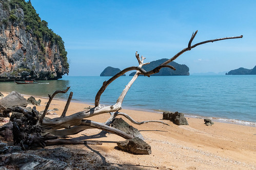
15 |
garydrummist |
This looks to be a fantastic location. There is a good sense of depth here with good foreground and background details. I think I would have experimented with the composition as some of the foreground details are blocking th background and not leading us into the image space. Cannot fault the quality of the image though. |
||
16 |
garydrummist |
This really is a great location and a wonderful image to see whilst in the midst of a UK winter! This one is similar to another entry so it is difficult not to compare them both against each other. I think this one is more successful with a lower horizon. The land that towers out of the water is obviuosly the subject which is great. I can understand including the foliage on the right but feel that it does intrude needlessly. In the ideal world t would have been great to have had one of the boats larger to fill a space centre left but as taken this is a great memory of a very memorable place. |
||