Main menu:
October 2021 Flickr Competition |
||||
Image Number |
Author/Flickr Name |
Image Title |
Position |
Judges Comments/Critique |
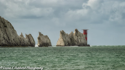
1 |
Louise Hubbard |
Although a very straight view of this classic location I like the feel of this image. The rugged, cool tones are nicely contrasted by the red lighthouse and I like the sharp fairly contrasty tones. |
||
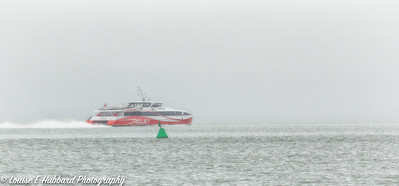
2 |
Louise Hubbard |
I like the cropped frame and the position of the craft which gives a real sense of movement. The tones are nice and soft and I like the contrast again with the red. Some may enjoy the green buoy but for me it is not positioned well and clashes with the vessel. Otherwise I quite enjoy this. |
||
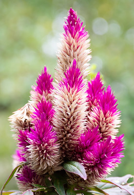
3 |
bwilde54 |
This is a nice, detailed and colourful study. The specimen is in very good condition and I like the colour combination. The white halos in the background are a little distracting but the image itself is very clean and bright. Nice. |
||
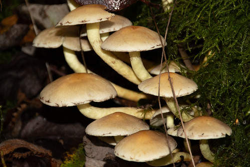
4 |
bwilde54 |
The analogy in the title is good as the shapes here are certainly reminiscent of umbrellas. This is an impressive fungi and cries out to be photographed. This is a well constructed composition but I think the photographer could have been more bolder and got in closer. The grasses in front of the fungi are a little distracting but remember where this was and return again as it is a great object to photograph. |
||
5 |
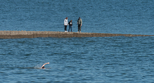
JohnHarvey96 |
I like an image with a story and this is a good example. Technically it is very good with great sharpness, exposure and detail. I like the composition with the contrasting construction stretching out in the sea. The swimmer is perfectly placed but to really make this it would have been great if the figures were further out to the right to balance the composition. Obviously I realise the photographer had no control over that and had to time his exposure with the view he had before him. |
||
6 |
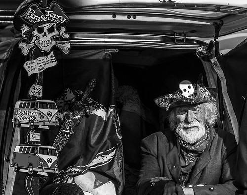
JohnHarvey96 |
This is a real character study. I like the inclusion of his 'wares' as this sets the scene. The monochrome is contrasty but there is important detail in the face. I hope the photographer took more portraits of Pirate Terry as his face is full of character. |
||
7 |
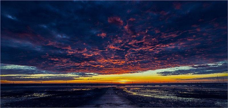
Henry Slack |
3rd |
An image stacked full of drama which reminds me of Hollywood films. The dark oppressive tones are broken with the remaining light that looks to be imminently engulfed. I very much enjoy how the composition is carefully arranged so that our gaze is led directly to the brightest area. Excellent. |
|
8 |
Henry Slack |
1st |
The composition here is just excellent and coupled with spot on exposure and contrast and superb detail we are presented with a top image. It is good to see that the subjects are in great condition as well. |
|
9 |
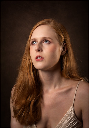
Roger Nolan LRPS |
2nd |
This is an extremely high quality portrait. From the faultless lighting to the arrangement of the hair there is so much to commend this. My only extremely minor adjustment would be to take a slither from the top of the image but that is such a small thing. Great.. |
|
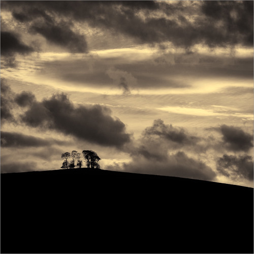
10 |
Roger Nolan LRPS |
SM |
The trees are the smallest part of this image but our eye is instantly taken to them as they appear to stand defiant against that big sky. I debated about the colour and wondered if I would have gone for a full monochrome treatment. This colour does add an air of stormy atmosphere to this though. |
|
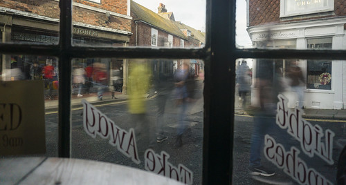
11 |
Keith Tomlins |
I like the idea behind this, the movement works well. I think I would have moved closer and used one of the window frames as a frame to the complete image. As presented the window frame acts as a barrier rather than inviting us to look through. I do enjoy the story created here though. |
||
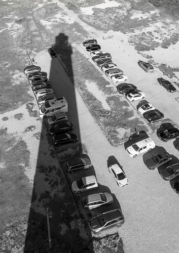
12 |
Keith Tomlins |
Using the shadow has been a clever tool here. Without it of course it would have just been a picture of a carpark. There is nothing in the image to say that this is Dungeness of course to someone who doesn't know the building so I would lose that from the title. Having the shadow off centre has been a good compositional move. |
||
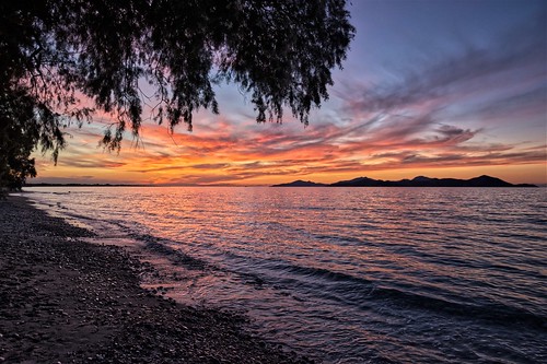
13 |
Jeff JT Thomas |
SM |
There is much to enjoy here. The exposure is very good ensuring detail in the sky and the water. The silhouette of the distant islands is strong and are well placed in the image. Including the beach in the foreground has added a nice depth to the image. I may have cropped off the left and part of the beach to strengthen what is already a good composition. |
|
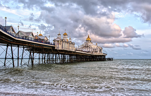
14 |
Jeff JT Thomas |
This is a classic view of Eastbourne Pier which is instantly recogniseable with its golden adornments. A very well taken image with great sharpness, detail and spot on exposure giving a full range of tones. The sky all adds to it. |
||
15 |
Ian Rosenthal |
SM |
This is a very nicely observed image. The colours reflected in the object closely replicate those of the window beyond and in addition I like how the ring at the bottom appears to connect wit hthe shape in the background. Well seen and well taken. |
|
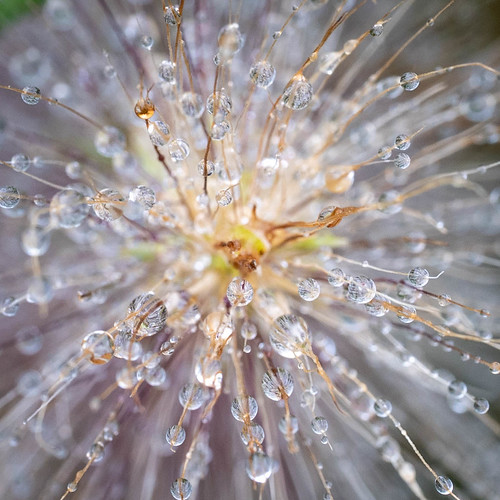
16 |
Ian Rosenthal |
The idea behind this image is very good. However, I think the exposure is too high and too much detail is lost in the out of focus highlight areas. I would try adjusting the exposure/contrast areas to bring this down whilst still emphasing the raindrops. A very good idea, well taken and well worth trying again. |
||