Main menu:
May 2022 Flickr Competition |
||||
Image Number |
Author/Flickr Name |
Image Title |
Position |
Judges Comments/Critique |
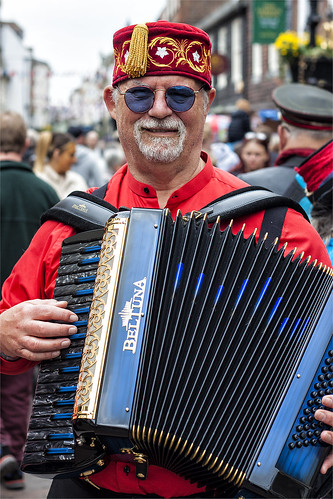
1 |
Best Snaps |
3rd |
Although at first glance a relatively simple image to take this I expect was actually quite difficult amongst the Rochester high street throng. The focussing and depth of field has isolated the colourful figure very nicely. The accordian players left hand is cropped awkwardly but otherwise this is a fine image. |
|
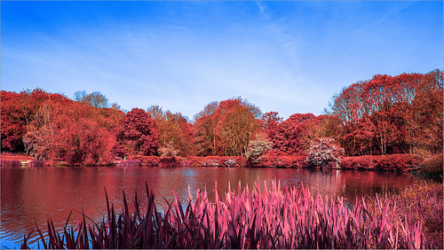
2 |
jwhiting1952 |
The infra- |
||
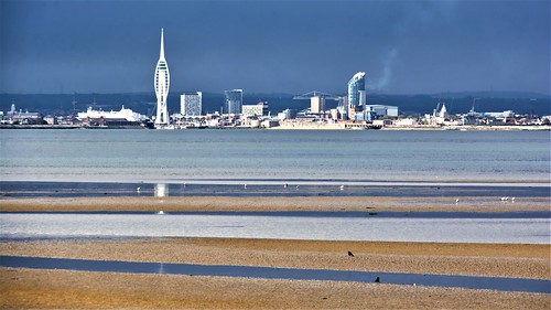
3 |
jeff JT thomas |
The use of a telephoto lens has created some nice compressed perspective here. The foreground interest works well to lead us into the image with its various layers. It is a shame that the contrast is a little high on the mainland buildings causing a loss of highlight detail but well done on creating a unique view. |
||
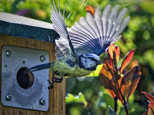
4 |
jeff JT thomas |
Well done on capturing this moment at the optimum time. The position of the wings is brilliant and I like the sense of movement in them. Unfortunately the point of focus is a little out and the head of the bird is soft but I do enjoy the colours and story in this image. |
||
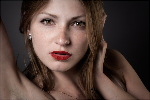
5 |
Best Snaps |
There is a nice quality to this image and technically the focussing, exposure and depth of field are great. The white garment could easily have been burnt out but there is detail throughout, as there is in the shadow areas as well. I think I may have warmed the tones a tad as the skin is a little pale but I do like the eye contact with the viewer. |
||
6 |
Roger Nolan LRPS |
1st |
This is a very high quality image with perfect detail and tones throughout. I don't often see portraits where the face takes up such a large area of image space but this works well and the other parts of the body out of shot frame the face nicely. Placing the face off centre is the finishing touch. Very good indeed. |
|
7 |
Henry Slack |
2nd |
I have seen this artwork elsewhere and know what a great piece of work it is. The photographer here has worked extremely hard to arrange it perfectly within the composition. In factI think the only area it doesn't quite line up is due to the building itself and even then it's just centimeters. Coupled with near perfect exposure this is a great interpretation of the art installation. |
|
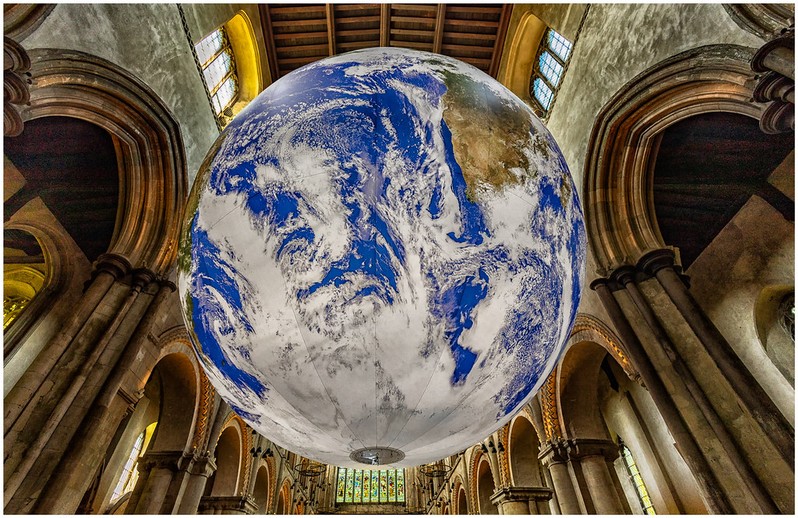
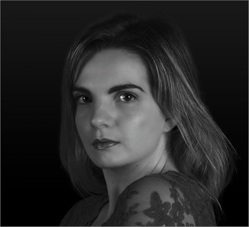
8 |
jwhiting1952 |
This image of Leah is full of detail and it is good to see a monochrome image of her. To aid the composition I wonder if a tilt to the head would have been a bit more dynamic than the present straight on, level arrangement of the eyes. The exposure and contrast are a little low for my tastes as well and I think trying a brighter image at least would add to it nicely. As I said earlier it is good to see someone trying monochrome portraiture. |
||
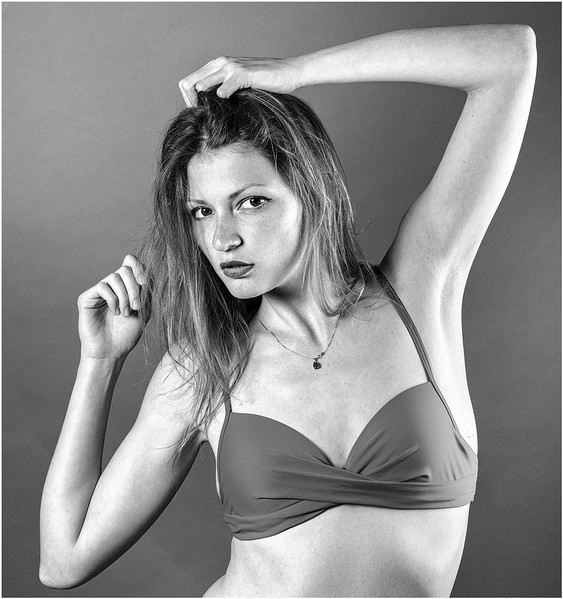
9 |
Henry Slack |
SM |
What makes this image is the pose which fills the image space beautifully. The eye contact is great and I think the choice of monochrome is good. Although it is a fine balancing act I think I would have lowered darkened the skin tones slightly to obtain some more tones in there or used a darker background. I really enjoy how the photographer here appears to have pre- |
|
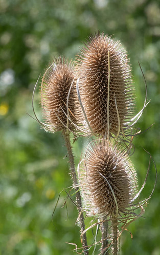
10 |
bwilde54 |
Nice edge lighting, good colour contrast with the background and good focussing isolates these teasels nicely. A tighter crop to remove the white highlights would elevate this even more. Nicely taken. |
||
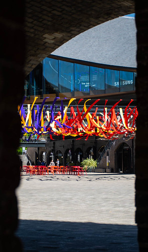
11 |
bwilde54 |
I must congratulate the photographer for discovering and utilising the frame here. The shapes in the background building and dark tones contrast well with the decorations. Unfortunately, the decorations are small in the image space but cropping the bottom shadow area up to just below the red seats really enhances the composition for me. |
||
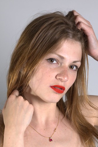
12 |
ronc30 |
There are a number of images of Maryna in this competition and like the others this is very competent. The tilt of the head and the all important sharp focussing on the eyes work well. I'm not sure about the firm clench of the top hand and the tones are just a tad too red but otherwise this is a fine portrait. |
||
13 |
ronc30 |
Creating a personal, unique recreation of someone elses artwork is not easy and the photographer here has taken the close up approach. The selection has produced a pleasing image although of course the original cloud cover does make for a burnt out featureless areas. Well done on leaving the cathedral roof timbers to give a sense f place to the artwork. |
||
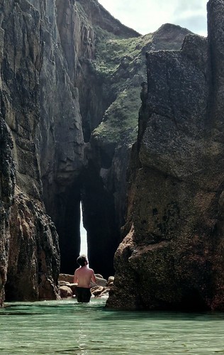
14 |
Keith Tomlins |
This image is all about the lighting for me with great detail on the rocks. The figure is perfectly placed within the gap and again is very well lit. I would have cropped out the large bright area at the top as this is by far the brightest area and draws my eyes away from the subject. Well spotted and well taken. |
||
15 |
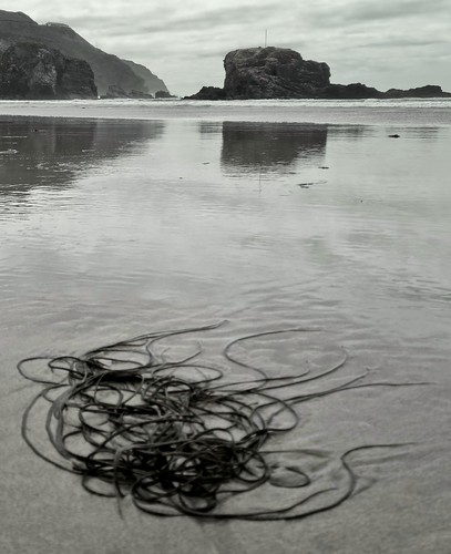
Keith Tomlins |
All the elements in this composition are well placed in the image space. The use of monochrome is good for this type of image. There appears to be a good range of tones and with a little post processing they could be enhanced nicely. The forground object in the sand is sadly out of focus and I think the use of a smaller aperture or some differential focussing could have been applied here. Well seen and worth another go if possible. |
||
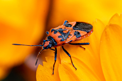
16 |
Ian Rosenthal |
SM |
This is a very attractive picture. The colours of the subject and the background work extremely well together and I enjoy the detail in the body of the insect. Unfortunately the head is not sharp either through movement or focussing and this is the only detraction in this great image. |
|
17 |
Ian Rosenthal |
SM |
I have to commend the photographer here for the excellent monochrome conversion which really enhances the globules of water. The composition works well although I may have cropped off the top soft white area. Very nicely taken. |
|