Main menu:
July 2020 Flickr Competition |
||||
Image Number |
Author/Flickr Name |
Image Title |
Position |
Judges Comments/Critique |
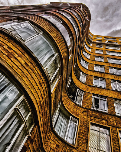
1 |
kevin towler |
SM |
This is an interesting view of an interesting building. The building has an Art Deco feel to it with those wonderful curves. There has been an effect applied which has worked well. I like the leading lines which takeus up towards the sky. There is some nice cloud detail but would it have been cheeky to add something in there like an aircraft? As it stands it is a striking and nicely produced image. |
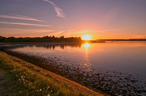
|
2 |
kevin towler |
SM |
I'm not sure if this is a straight reflection or whether there is something else going on here but nevertheless this is very different. Everything hinges around the colour red with the white stars creating a nice foil. The shapes also work well. |
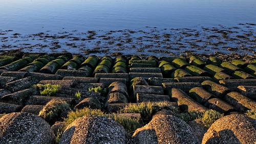
|
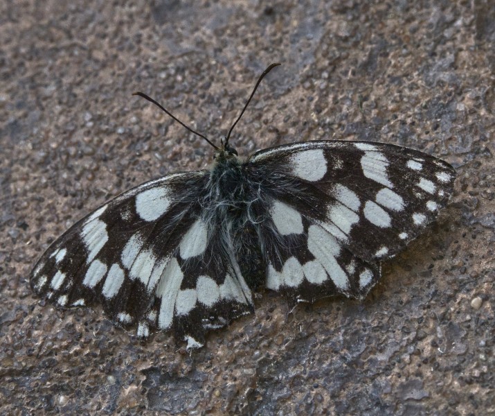
3 |
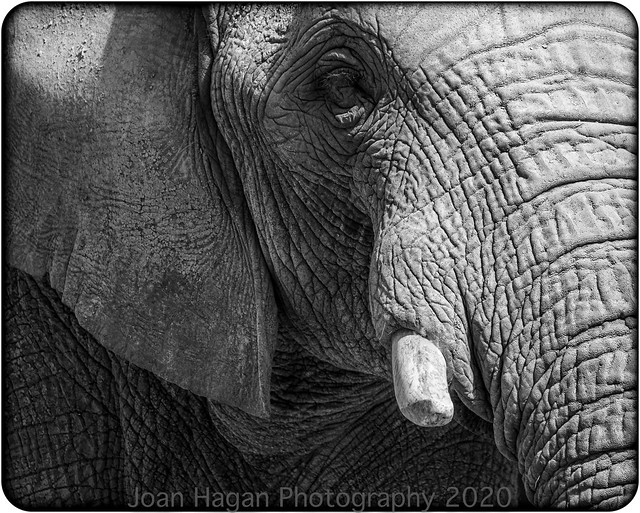
jsnewy |
This image of a garden visitor is certainly very sharp and detailed. The lighting is very flat which has subdued the colours somewhat but has in turn allowed the photographer to capture a wide range of tones. |
||
4 |
John Whiting1952 |
The pigeon itself has been very well captured photographically. The pose on the branches is very good as is the depth of field and focus point which takes our eyes straight to the pidgeons own eye. The white parts in the background are a distraction which cropping could reduce but not totally eliminate. To me the image also appears a little too warm in the colour balance. This is still a great image of this bird in the urban environment. |
||
5 |
steveakehurst |
This has been nicely spotted and well timed to capture this little chap. The composition is good although I think I would have cropped off the top mortar line. It is a shame that the side of the face towards us is in shadow. Although not pin sharp I do like the story here and if local I would certainly return to this location. |
||
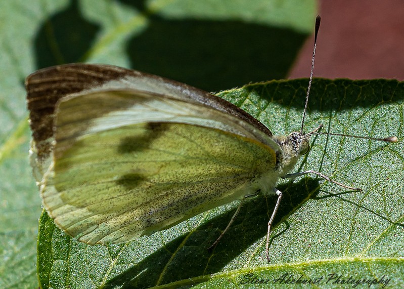
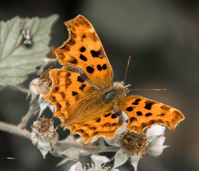
6 |
steveakehurst |
The detail on the leaf and the head of this butterfly is excellent, helped by the strong lighting. Unfortunately, the shallow depth of field often encountered when shooting macro has created an expanse of soft detail. Sharp areas in a photograph do grab our eye which this one successfully does but I suggest a strong crop on the wing would strengthen this image immensely. Well done though on the sharpness and detail in the head area. |
||
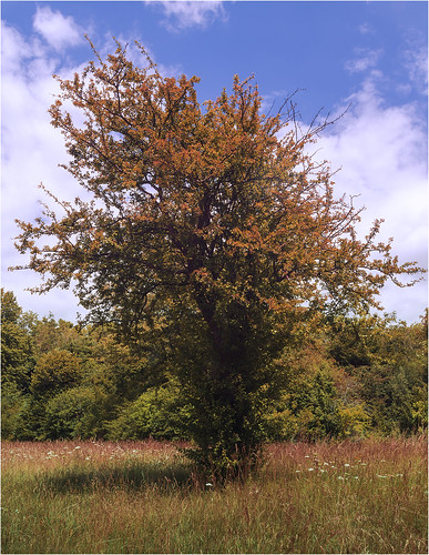
7 |
John Whiting1952 |
Lone trees have long been popular subjects with photographers and it is not unknown for certain trees to be photographed throughout the seasons. This tree has been nicely photographed but the image needs a stronger composition or extreme lighting to elevate it. This could be a good basis for a project though as I said above. |
||
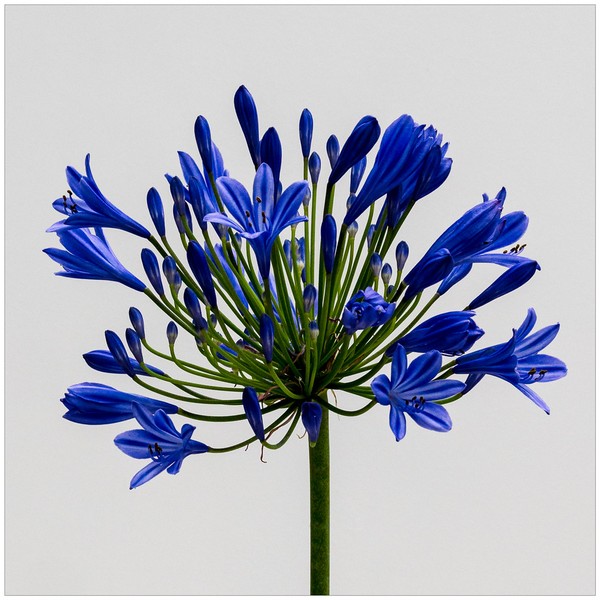
8 |
Henry Slack |
2nd |
A very straight forward shot at first glance but this is really a very competent image. The detail, tones and sharpness in the plant are to a very high order as is the controlled lighting. Simple but effective. |
|
9 |
Henry Slack |
1st |
Another excellent still life. The camera on its own is a very high quality piece of work but including the photos and the album gives this image a story and thereby lifts it above the average still life. Again the excellent lighting reveals all the lovely detail and the patina of the camera and careworn album. A nicely crafted image indeed. |
|
10 |
Robert Deane |
The centrepiece of this image is the stained glass window which has been very nicely rendered. Being the brightest part of the image and nicely in focus it really catches the viewers eye. In comparison the surrounding stonework is a little subdued. I wonder if an HDR technique at the taking stage would have improved the image. HDR could have added some more colour and contrast to the stonework and lifted the tones as well. The composition itself is actuall y very good and I like the way the ealls seem to invite us into the image and look at that window. |
||
11 |
Louise Hubbard |
This is unmistakeably Dungeness and it works very well as a monochrome image. The boats are rendered very well and there is also great sky detail. I think I would have made the sky more dramatic as the image does seem to be a little flat. Dungeness images will invariably have open skies which can accentuate the horizon which unfortunately here is not level. A tad more contrast and the horizon sorted and this will be an even greater image to me. |
||
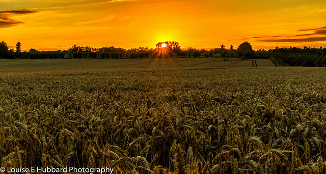
12 |
Louise Hubbard |
3rd |
A nicely timed and composed image. The sun disappearing behind the trees works very well and I like the rays of light. The depth of field and the nice sharp crop detail is great. The complete lack of flare with good contrast also reveals how clean the lens was that took this. |
|
13 |
Keith Tomlins |
Compositionally this is a nicely constructed image with foreground interest, the figure, linking us to the background with a lovely frame formed by the ground shadow and the trees. The figure does feel a little awkward placed in the shadows and the frame, great as it is does obscure the view we are promised in the title. However, I feel the photographer certainly understands how composition works which is to be applauded. |
||
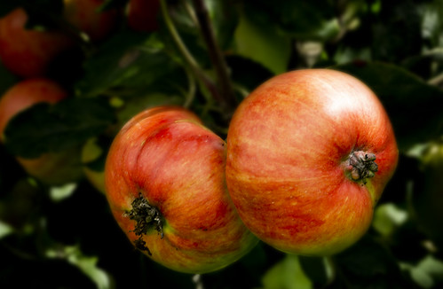
14 |
Keith Tomlins |
Colour has been used very nicely here with the warm colours of the fruit very much to the fore with the cooler greens receding into the background. The edges of the fruit are a little soft and there could be some slight camera shake here but I do like the colours displayed here. |
||
15 |
johnharvey96 |
Although the depth of field is a little shallow here it is deep enough to reveal some excellent detail in this plant. I like the colour combination especially the purple and the light splines that twiat around the plant work well too. The image is presented as a landscape but I wondered how it would look in portrait mode. |
||
16 |
johnharvey96 |
I do like the three quarter view of this insect. The high viewpoint can often provide deeper depth of focus and here its only the nearest wing tips that are soft. There are a couple of distractions I may remove such as the object on the leaf and the strange white line bottom left. Again, there is a nice colour combination here where although the lighting is dull the orange colours of the insect really bring it out from the background. |
||
17 |
jeff JT thomas |
There is a nice recession here and a good mix of manmade shapes that give way to nature's creations then the sea. This could be classed as a pattern picture and I think another element maybe on a third somewhere could bebeneficial to the composition. I have mentioned this a few times this month but once again here we have a good use of colour with warmest close to the camera and cooler receding colours further away. |
||
18 |
jeff JT thomas |
Our eyes will invariably go to the brightest part of an image and that is certainly true here. We also have leading lines that also take us there as well. I like the light on the foreground and indeed that sweep around. There are expanses of dead image space and I wonder if a crop off the sky and to the right thereby placing the sun directly on a third would strengthen the image. Nice colours and good control of flare in a situation that can be a real challenge for cameras. |
||
19 |
Joan Hagan |
SM |
There is a huge amount of detail here and the monochrome treatment is perfect for it. It is a nice tight crop but the composition works well. There is detail throughout the contrast range too. It is a slight shame that the eye is in shadow but we can still see the detail there. Very good. |
|