Main menu:
July 2022 Flickr Competition |
||||
Image Number |
Author/Flickr Name |
Image Title |
Position |
Judges Comments/Critique |
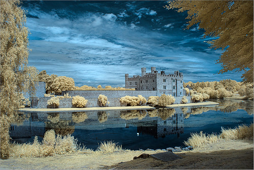
1 |
Roger Nolan LRPS |
I used to use the classic Kodak infra red film back in the day so it is interesting to see this modern digital incarnation. This image certainly displays all the classic infra red attributes with dark skies and glowing foliage. I find the pnk colour a little off putting and I think I would have resented this as a pure monochrome. I like the composition though and that important tree is nicely placed. |
||
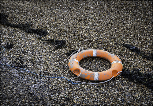
2 |
Stephen Long2011 |
This a nice exercise in image construction. The life belt is placed on the third and there are natural lines that lead us to it. I think I would have cropped the top slightly but that orange colour really sings out well from the surrounding dull colours. |
||
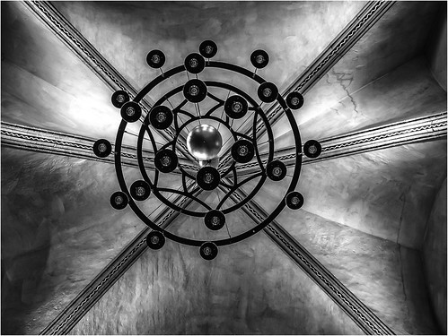
3 |
Stephen Long2011 |
SM |
I had to look at this closely before I realised we were looking straight up at the base of this light fitting. The effect is very good and the dark black areas contrast nicely with the softer tones of the stonework. There are some mackie line effects around the chandalier which could indicate over sharpening but these do not appear elsewhere so it could be natural alighting effect but be aware of this if it an oversharpening result. Without doubt the globe is agood addition to the composition.. |
|
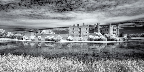
4 |
jwhiting1952 |
Digital colour infra red certainly prosuces unique images that still retain the classic film infra red characteristics of glowing foliage and dark skies. The colour combination works very well here. The stonework looks a little flat and has taken on the blue tint slightly and I wonder if after selecting this in your software if this could be enhanced? I enjoy the composition and the natural frames. |
||
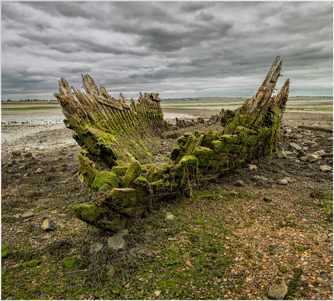
5 |
Henry Slack |
SM |
This is a highly detailed image of this sad but very photogrenic spectacle. With the sky being so grey I pondered if this has been colour popped. The colour of the vessel does seem a little too yellow/green but this could be emphasized by that grey sky. I do like how the clouds seem to emulate the shapes in the boat. Nicely seen. |
|
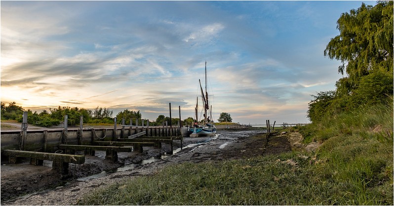
6 |
Henry Slack |
A calm and quiet scene which would look great on any wall. I assume Edith May is the vessel which is a small part of the composition. However, the careful arrangement contains leading lines which take us directly to it. The 'L' shape of the foliage works very well indeed. The bright areas caused by the sun on the edge of the image do drag our eyes away from the boat a tad but I do enjoy the quality here. |
||
7 |
jwhiting1952 |
The infra red effect has worked very well here and although completely false the contrasting colours also work well. I am very impressed with the detail in the tones so it is a slight shame that they are completely burnt out at the top of the plant at the centre. The composition is good especially placing the other plant in the forefgound at the right to act as a frame. |
||
8 |
johnharvey96 |
3rd |
This is a well captured moment. It could be an enlarged section but it does not display some of the issues that can introduce so is nicely presented. I like the story here and the lack of distractions in the muted background. |
|
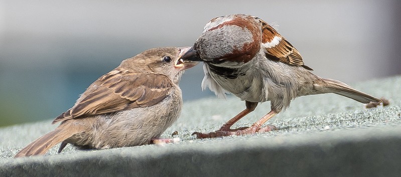
9 |
johnharvey96 |
We often see robin images showing the birds perched on a spade handle etc so it is interesting to see one feeding from a hand. The robin itself is nicely rendered although depth of field does fall off a tad but the all important eye is nice and sharp. Bright areas in the background and the light skin tones are a little distracting but this is again a well captured and nicely timed image. |
||
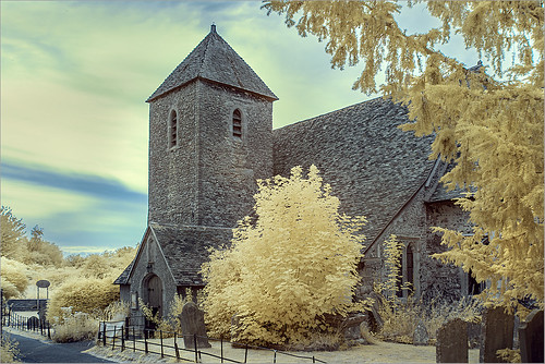
10 |
steveakehurst |
This is a nicely detailed image of this church. The stonework in particular is very well rendered. The image looks to have been taken at sunset as the sun is obviously behind the church and there is colour in the sky and also an overal red tinge. With these sunset colours in the sky I would have darkened and emphasised these to turn this into a more pictorial image. Using the grave in the foreground has created a nice composition. |
||
11 |
steveakhurst |
Capturing lightning is not easy so well done with capturing this image. The lightning itself is a bit small in the image space so filling the space with other flashes could be recommended. As I said earlier well done with capturing this as I have never quite managed it myself. |
||
12 |
Roger Nolan LRPS |
2nd |
Using the infra red technique has really lifted this image from what could have just a mundane shot. However, the photographer has shown their skill with this as it would have been easy for the lighter tones to either burn out or to merge into each other. Nicely done. |
|
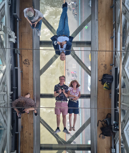
13 |
Keith Tomlins |
1st |
I will hazard a fairly educated guess that this is Tower Bridge but having never used the raised walkway I don't know how this was captured. What I do know is that it is extremely well taken and the composition is nicely balanced all round. Very well done. |
|
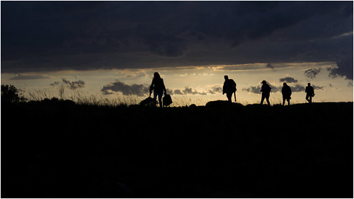
14 |
Keith Tomlins |
A simple composition and very good colour contrast with a figure running into the image and placed in the perfect position. Maybe a tad yellow but a very effective image. |
||
15 |
jeff JT thomas |
SM |
There is a great deal to commend here and in fact the only thing I would change if it was mine would be to crop the bottom to make this letterbox shaped. The figures placed against the light area is great. |
|
16 |
jeff JT thomas |
This is another well taken image. I especially like how the lavender lanes take our eye straight to the building. As a slight adjustment I might have transformed the lavender so that it was levell across the image. As presented I would certainly look at the colour balance which apart from being a little too saturated is a little on the blue side. I can't fault the overal composition though. |
||