Main menu:
April 2025 Flickr Competition |
||||
Image Number |
Author/Flickr Name |
Image Title |
Position |
Judges Comments/Critique |
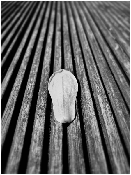
1 |
paulrayment4500 |
The obvious attraction of this image is the dynamic lines that draw us in. The petal is nicely placed as is the point of focus. I like the monochrome treatment but there are some burnt out areas. A striking image. |
||
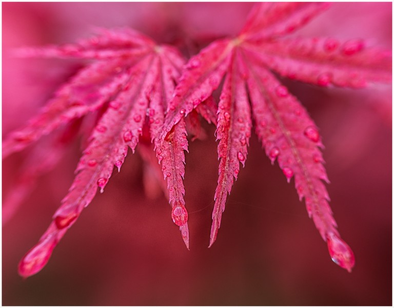
2 |
Henry Slack |
I must commend the photographer here for the careful control of the single colour to create some nice tones. The water droplets are always a nice addition. The shallow depth of field is good but I think I would have liked closest parts of the plant to be in sharp focus. A very nice arrangement. |
||
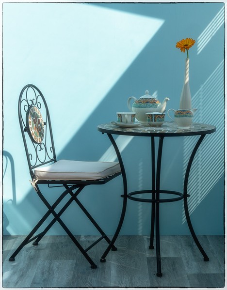
3 |
Henry Slack |
3rd |
The still life effect of the table and chairs is good on its own but what makes this is the light and shadows. It is clever how the areas that could burn out are in the shadows. The pattern on the chair is nicely in the lit area. |
|
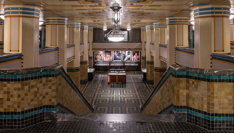
4 |
johnharvey96 |
This is a carefully arranged and well taken interior shot. The lighting is nicely controlled as are the verticals which are near perfect. As presented I view it as a record shot which is fine but a nicely placed figure could easily have turned this into a pictorial image. |
||
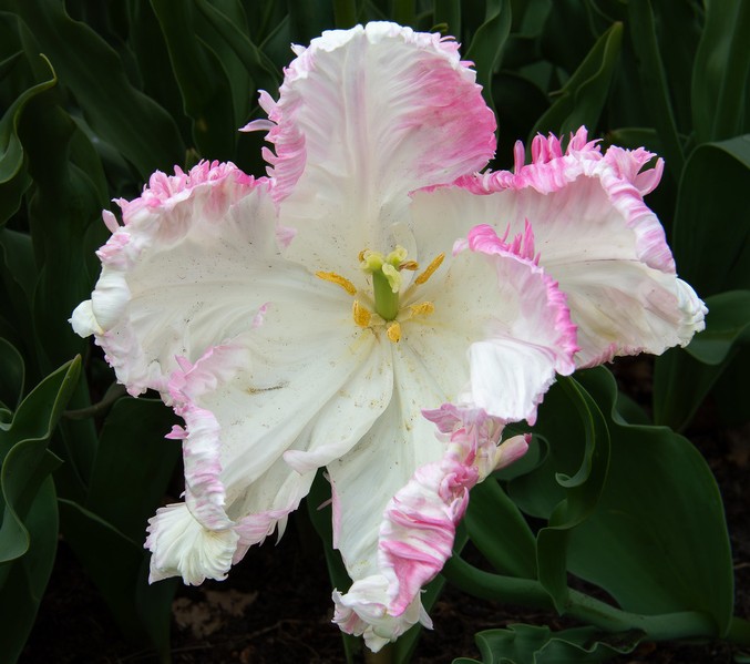
5 |
johnharvey96 |
What a very flamboyant flower this is looking not unlike a can- |
||
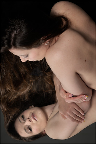
6 |
Roger Nolan LRPS |
1st |
This is something very different. Both the subject and the reflection are of extremely high quality and the arrangement is very good. At first glance I wasn't sure if this was a portrait or a landscape image but in hindsight I think both ways work. |
|
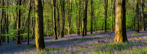
7 |
Roger Nolan LRPS |
SM |
Bluebell woods images are always popular and the secret to a good image is the lighting. The lighting here is very nice and it is good how the highlights and the shadows both retain details. Nice warm colouring too. |
|
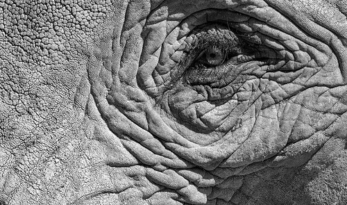
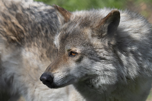
8 |
garydrummist |
There is an absolute wealth of detail here and the skin texture is perfect for monochrome. Sharpness is high as is the contrast a tad. It is a shame the eye is in shadow but otherwise this is a fine image. Well done on placing the eye on the third! |
||
9 |
garydrummist |
2nd |
Beautiful colour and detail and the focussing is spot on. The angle of the eye means we cannot see the puplil but that is a minor point here. Very nice. |
|
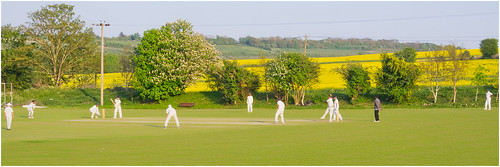
10 |
jeff JT thomas |
This is a nice summer scene taken in nice lighting. I think I would have cropped out the right of the image to tighten the composition and adjusted the contrast, colouring and brightness to strengthen the colours. Well done on going for the letterbox crop. |
||
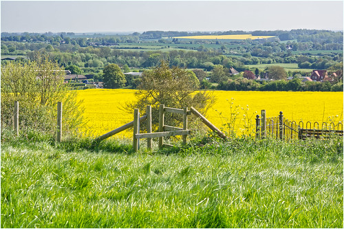
11 |
jeff JT thomas |
A nice Kentish scene with a wealth of possibilities to experiment with different compositions. The composition chosen here is good but I may have been inclined to bring the stile further forward into the foreground. Nice lighting and good sharpness. |
||